What happens when design and perception come together?
The result of dealing with this question are Gestalt principles, which provide simple laws to understand the perception of design better and thus make better design decisions. These principles go back to Max Wertheimer (1923).

In design, unfortunately, not only must every single element look good. You also must think about how the different components work together. Let’s start with the law of proximity.
Law of Proximity
The law of proximity states that elements in spatial proximity are perceived as belonging. For example, to perceive a label as belonging to a specific field, it must be placed in spatial proximity to the field. The closer elements are to each other, the easier the assignment usually is, as shown in this figure.
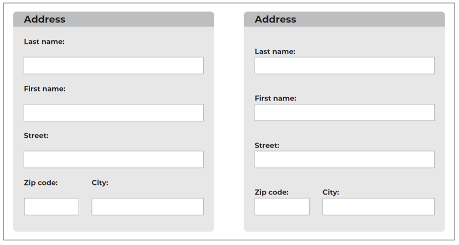
On the left, deciding which field the label belongs to is challenging unless you look at the entire interface from top to bottom. In this version, the field label could also have been placed below the field. This relationship becomes apparent only by spatially placing the label near an element. You can see how this placement affects perception and interpretation differently on the right, where there is less room for interpretation.
Law of Similarity
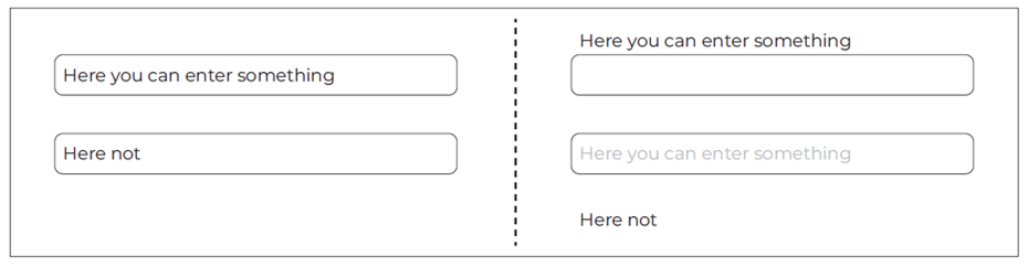
Another law is the law of similarity, which states that similar elements are perceived as belonging together. Thus, when designing UIs, attention must be paid to the visual separation of similar but functionally different elements.
A typical mistake in the design of forms, for example, is to design text fields where users are supposed to make entries that look exactly like text fields where explanatory texts are displayed by the system, as shown here.
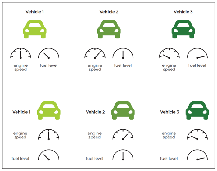
This mistake can even happen when the content has little to nothing to do with each other. Imagine, for example, that you’re at an engine test bench monitoring engine speed and fuel level in software. In general, the displays could look quite similar visually (semicircle scale), except that in one case, a high value is good, and in the other case, a low value. If the design is poor, the displays would be mixed and sorted only by vehicle. In a better design, the displays would be sorted by vehicle and type, as shown in this figure.
It's essential for you to know that the law of similarity refers to various aspects. Thus, elements can be perceived as similar with:
- The same color
- The same texture
- The same alignment
- The same style
- The same direction of motion
- The same size
- The same speed
Thus, you can use various design aspects to ensure that the proper elements are perceived as belonging together.
Law of Closure
Another Gestalt principle is the law of closure, which states that the viewer fills in missing components of a “closed” design. Applied to UIs, users often look for a structure and a higher-level logic to move more quickly through the interface.
However, elements in UIs often fail to create a “complementary” shape, making grouping challenging to perceive and making it harder to find information. You can help your users find the structure by designing your UI to highlight them visually.
For the example shown in the figure below, whether each text block forms a unit by itself is unclear.
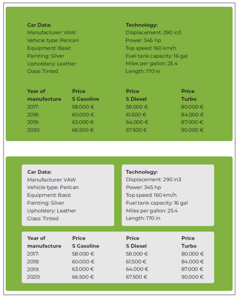
Visually, the blocks “Car data,” “Year of manufacture,” and “Price S Gasoline” as well as “Technology,” “Price S Diesel,” and “Price Turbo” could also belong together. In the lower part, however, the structure becomes recognizable.
Law of Continuity
The law of continuity states that elements are perceived as belonging together when they appear as a continuation of previous elements.
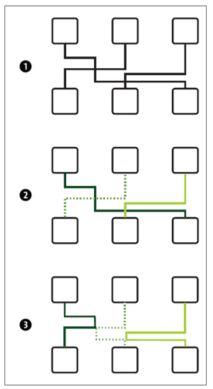
Again, users try to discover a logic in the design. Looking at (1) of the illustration shown above, you can probably tell quite accurately from the illustration where you think the lines lead.
Presumably, you would make the assignment (2). We have shown you an alternative (3), which theoretically would also work. However, due to the law of continuity, the lines are more likely to be perceived as continuous.
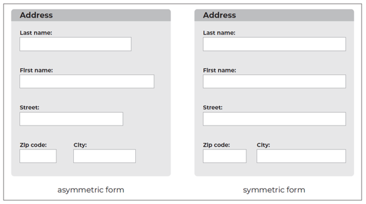
Law of Symmetry
Another Gestalt law is the law of symmetry. An element is perceived as symmetrical (balanced) when its attributes are in equilibrium. Sometimes, UIs are often designed so one-sided that this perception of symmetry is disturbed. Especially when using forms, a one-sided alignment is usually found in the UI. You can avoid this lopsidedness by ensuring the elements are evenly distributed, as shown in this figure.
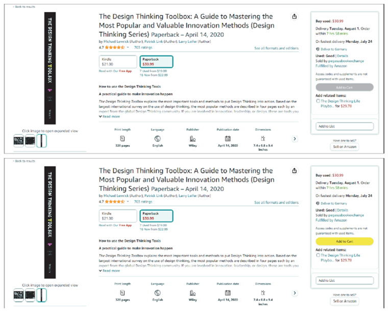
Law of the Point of View
A law of design often used unconsciously is the law of the point of view. When you use one element significantly different from the rest, you draw attention to this element. This approach is regularly used in website design to make the CTA stand out clearly from the rest. This choice lets you control the user’s gaze with simple means, as shown below.
Law of Figure/Ground
In the design of UIs, the law of figure/ground plays a significant role. This law questions how to declare which elements users need to focus on for interaction and which elements are only used as decoration.
To help users make these distinctions as quickly as possible, make sure that the elements in focus have a clear shape and boundary, whereas the background is somewhat amorphous. The background should also continue without gaps behind the elements in focus so that the elements obscure parts of it. All elements in focus should appear closer and at a fixed position, whereas the background may appear farther away and positionless, as shown in this figure.

Law of Common Fate
The law of common fate has become increasingly important for the design of UIs, especially in recent years. This law states that elements are perceived as belonging together if they change simultaneously or move similarly.
Recently, more and more websites and software solutions have incorporated animations that move individual elements or areas of the UI. If you plan to do the same, make sure that the elements that belong together also move together. Since animation is challenging to show in text form, we’ll try to clarify this law using suggested directions of movement, as shown here.
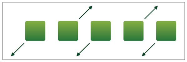
Due to the law of common fate, shapes moving in the same direction are perceived as belonging to each other. Viewed from left to right, the first, third, and fifth elements move downward to the left according to the arrow. Thus, they form a group. In turn, the second and fourth elements move upwards to the right and thus create a second group.
7
Law of Visual Hierarchy
Whether a UI is later deemed well structured and easy to understand depends heavily on whether it succeeds in presenting a clear order. The law of visual hierarchy helps you to create this order precisely. You can influence the perceived order by using an element’s particular size, special shape, or other attributes, as shown in the final figure.

In the text, the headline “Wonderfull.” has the highest hierarchy level, followed by “iPhone 14” and the pricing text and button. Overall, however, the image is also very dominant.
Editor’s note: This post has been adapted from a section of the book Usability and User Experience Design: The Comprehensive Guide to Data-Driven UX Design by Benjamin Franz and Michaela Kauer-Franz. Benjamin received his doctorate in engineering; his UX-related dissertation on highly automated driving was awarded the Walter Rohmert Research Prize. In his jointly founded and managed company, Custom Interactions, he focuses on user interface design. He also works as a lecturer and a keynote speaker. Michaela has a doctorate in psychology with a focus on product design and user experience. Together with Benjamin Franz, she founded the data-driven UX agency Custom Interactions, which they manage together. She also contributes her extensive experience as a trainer, a lecturer at Technische Universität Darmstadt, a speaker, and on an International Organization for Standardization (ISO) committee.
This post was originally published 4/2024.


Comments